No products in the cart.
What You Can Learn from Iconic Logos

Why would you try to reinvent the wheel when you can find one that’s already rolling and adapt it to fit your cart? Wait now, don’t get this twisted.
We’re not saying copy an existing idea verbatim and use it to your benefit. Instead, we’re advising you to take what you can learn from iconic logos and base yours on similar principles to help you achieve comparable results. (Image Credit: Simon Steinberger/Pixabay)
Consider these examples.
Target
While it might seem like a no-brainer to use the image of a target for the brand’s logo, this choice could have been a fail. The bold red and white color scheme makes the symbol pop. While one of the fundamentals to keep in mind when you design a free logo with a service like Shopify’s is to make your design work just as well in black and white as it does in color, Target’s logo loses much of its “bite” in monochrome. With that said, the symbolism behind the color choices speaks volumes to the way Target is perceived. Red says passion and significance, while the white background says clean, healthy and honest. The takeaway here—color choices matter.
Adidas
The central element of the three-stripe brand’s logo has been used in a number of different ways since it was launched back in 1971. While the logo itself has changed a number of times over the ensuing years, the three stripes have always been incorporated. That uniformity makes each permutation of the Adidas logo readily identifiable. This consistency has also permitted Adidas to run two very different logos simultaneously, proving you can get away with this—as long as you have a unifying element.
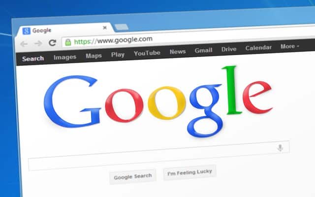
Most people’s first introduction to the Google logo was on the search engine’s home page. Easily the most innovative use of negative space ever seen, at one time Google’s home page consisted solely of the logo and a window into which users typed search terms.
In an environment in which every other search engine’s home page was cluttered with gimmicks, ads, news and other information, Google’s stood out. In fact, it was so simple, people were flummoxed by it until the company put a small copyright notice at the bottom, so people would know the page had rendered and was ready to use.
This made the company’s logo stand out in bold relief, while instantly equating it with simplicity. Straightforwardness makes a logo instantly recognizable and memorable. It also conveys confidence.
This is the Holy Trinity for logos.
Amazon
There’s a lot more to that smiling arrow than meets the eye. While you might not have taken it all in at first glance, the underlying meanings communicated directly with your subconscious. Ranging as it does from the “A” in Amazon, to the “Z”, the arrow implies you can find everything from A to Z at the site. The arc of the arrow also implies fast service with a smile.
That it accomplishes all of this without being overt about it demonstrates how you can use subtlety to your advantage.
Further, all of the brand’s other enterprises now employ the arrow—often without the name—and you know you’re looking at Amazon just the same. In other words, it’s memorable too.
A careful examination of these four iconic logos will teach you volumes about good logo design. Given it’s one of the first impressions consumers will get of your business, it’s important to consider what your choice of symbols will say about your business.
You should also keep in mind all the different ways logos tend to be used. This will help you be certain yours will look good in whatever capacity it is called upon to serve. Taking what you can learn from these iconic logos and applying similar concepts to your design will ensure it’s capable of representing your business well—and for a long period of time.


Leave a Reply