Incorporating bold colours into your home décor can transform a space, adding vibrancy and personality. However, many people shy away from these hues; fearing they might overwhelm the room. The key to using bold colours effectively is balance and strategy.
Understanding Bold Colours
Think about vibrant, eye-catching hues like deep reds, bright yellows, rich blues, and vivid greens are a few examples of bold colours. They make a powerful statement and bring energy to a room. However, using them requires a thoughtful approach to maintain harmony; avoiding a chaotic appearance.
Start Small
If you’re new to using bold colours, start with small doses. Introduce these colours through accessories like cushions, throws, artwork and rugs. This allows you to experiment without committing to a large-scale change. For instance, a deep green rug on the natural hue of solid wood flooring can add a pop of colour without overwhelming the room.
Use the 60-30-10 Rule
The 60-30-10 rule is a timeless interior design guideline. It suggests that 60% of your room should be a dominant colour, 30% a secondary colour and the final 10% is for an accent colour. You can use this rule as a guideline when incorporating bold colours. For example, if your dominant colour is a neutral shade, your secondary colour could be a softer hue and your bold colour could be used for accents. This creates a balanced look where your bold colours enhance rather than dominate your space.
Create an Accent Wall
An accent wall is a fantastic way to incorporate a bold colour without overwhelming your entire room. Choose one wall to paint in a bold hue, while keeping the other walls neutral. This technique draws attention and creates a focal point without making the space feel too busy. Pair the accent wall with complementary décor to tie the room together.
Balance the Neutrals
Bold colours can be intense, so balancing them with neutral tones is essential. Neutrals like white, grey and beige can tone down the vibrancy of bold colours, creating a more harmonious space. For example, a bright yellow chair can be balanced with grey rug and white walls, making the colour pop without feeling overpowering.
Consider Colour Psychology
Colour psychology plays a significant role in how we perceive and feel about spaces. Distinct colours evoke different emotions. For example, blue is calming, red is stimulating and green is refreshing. When choosing bold colours, consider the mood you want to create in your space. A bright red might work well in a dining room to stimulate conversation, while a deep blue might be better suited for a bedroom to promote relaxation.
Use Bold Colours in Functional Items
Incorporate bold colours through functional items like furniture and fixtures. Consider a brightly coloured sofa, a vivid kitchen backsplash or a bold area rug; these can make a statement without overwhelming your space. They also become focal points as they draw the eye and add interest to your room.
Mix Patterns and Textures
Mixing patterns and textures can help you seamlessly integrate. This pairing can add depth and dimension to your space. For instance, a bright red pillow with a geometric pattern can be paired with a textured grey blanket. A large-scale example could be herringbone flooring paired with a plain but brightly coloured rug. These combinations can keep your home feeling dynamic and visually interesting.
Use Lighting to Your Advantage
Lighting can significantly affect how bold colours are perceived. Natural light has an enhancing effect, making them appear more vibrant. You can use strategic lighting to highlight bold colours such as spotlights or lamps. Additionally, consider how the colour changes under different lighting conditions throughout the day to ensure it always looks appealing.
Be Mindful of Proportions
Proportions are crucial when working with bold colours. Too many can be overwhelming, but too few can be ineffective. You want to strike a balance by using bold colours in proportion to the size of your room. In smaller spaces, use these hues sparingly to avoid a cramped feeling. Whereas in larger rooms, you can afford to be more generous with your colours.
Embrace Bold Combinations
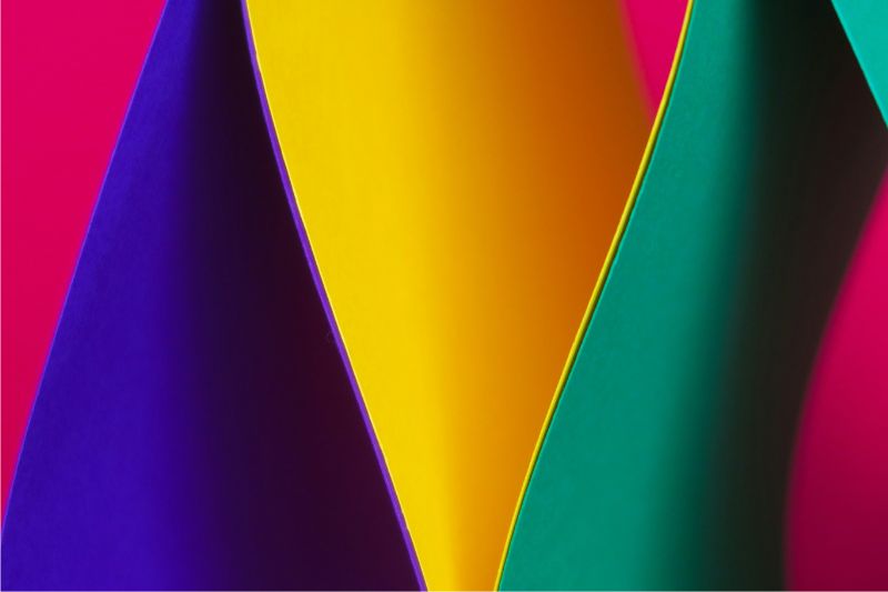
Bold colours don’t always have to be solitary; they can shine in combinations with strategic pairing. For example, complementary colours like blue and orange or purple and yellow can create a dynamic and balanced look. Analogous colours like blue and green can also work well together; instead providing a harmonious yet vibrant feel.
Use Nature as Inspiration
Nature is always a reliable source for bold colour combinations. Look at flowers, landscapes and animals to see how these hues can coexist peacefully. For instance, a bright green leaf with a red flower can inspire a bold colour scheme in your living room. Nature’s palette is a testament to how bold colours can work beautifully together.
Trust Your Instincts
More than anything else, it’s important to trust your instincts when it comes to incorporating bold colours. Your personal style and preference play a key role in creating a space that feels right for you. If a particular bold colour, like blue, resonates with you, find a way to include it so that is aligns with your taste and the overall vibe you want to create in your home.